
CAMPAIGN ADAPTATION · OUT OF HOME · DIGITAL · PRINT
UCLA HEALTH · AGENCY: CULT
Case study · UCLA Health
One approved design. Every surface it had to land on.
UCLA Health is a large academic health system, and everything that carries its name goes through a brand standard and an approval chain first. Cult, the design agency behind its promotional work, signed off the campaign design. The job here was turning that one approved design into every asset the media plan called for, at the exact spec each placement demanded.
The credit
Made by Alexandre Chaput, before In Fair Light existed.
Adaptation and production for an institutional client, working through their agency. This is career work, shown here because the discipline it needed is the one the studio still runs on: somebody else's standard, held exactly, across every format that ships.
Role
Graphic designer
Scope
Campaign adaptation and asset production
Client
UCLA Health
Agency
Cult, the design agency behind UCLA Health's promotional work
The brand
None of it was ours to change.
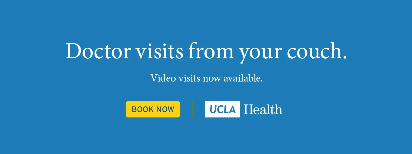
The blue, the serif, the white logo box and the yellow button were all settled long before the brief arrived. On an account this size, the work happens inside somebody else's system: where the headline breaks, how much air it gets, and which element survives when the canvas drops to 196 pixels wide.

The formats
Six of the sizes one message had to ship in.
One message, Doctor visits from your couch, going out across social, live event venues, bus sides, billboards and video walls. Each placement carried its own output spec for print, web and digital display. The narrow unit is the real test: at 196 pixels wide the headline breaks four ways, the button still has to read, and the logo lockup has to stack instead of sit on one line.





The messages
Three campaigns, one system, no redraw.
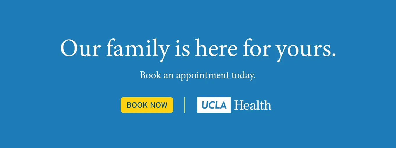
Doctor visits from your couch. It's time to resume your health care. Our family is here for yours. Each message arrived as one approved design and went out as a full asset list. Same system, same specs, three times over, which is the whole point of building it properly: the second campaign is production, not another round of design.
Start a project
Get in touch
Have a brand that has to hold at every size?
Campaign systems, brand adaptation, launch films. On a large account it's the same question every time: does it still look like you when the canvas changes?